Teck

Overview
Teck is one of Canada’s leading resource companies, with a large digital ecosystem serving multiple audiences, regions, and business needs. As the platform evolved, the challenge was not only to redesign the user experience, but to create a scalable system that could be implemented progressively without disrupting the existing website.
As Lead Designer, I led the UX/UI design of the platform and translated Teck’s new brand direction into a scalable digital design system. Working closely with the agency responsible for the brand evolution, I transformed the visual identity into reusable components, responsive behaviours, interaction patterns, and clear design rules for digital experiences.
I also collaborated with a distributed development team across multiple countries to define a modular design and implementation strategy. This approach allowed sections of the website to be progressively redesigned, developed, and released while the rest of the platform remained fully operational.
Key Services & Role
I led design on the Teck website redesign, working across two distinct collaborations. On the creative side, I partnered with a Vancouver-based agency who developed the initial moodboard; together we ran workshops to define Teck's new voice, visual direction, and overall look and feel. On the execution side, I designed the homepage, one inner page, the full design system, and the design-to-development handoff documentation — then worked closely with a UI designer based in Germany who handled implementation and deployment.
Throughout development, I collaborated daily with engineering teams across Asia and South America, effectively running a 24-hour working cycle: as one region wrapped up for the day, the next picked up the thread, which kept development moving continuously and helped us hit an otherwise tight schedule.
- UX Strategy — Information architecture, user journeys, content hierarchy, and responsive experience planning.
- UI Design — Translation of the new brand direction into a cohesive and accessible digital experience.
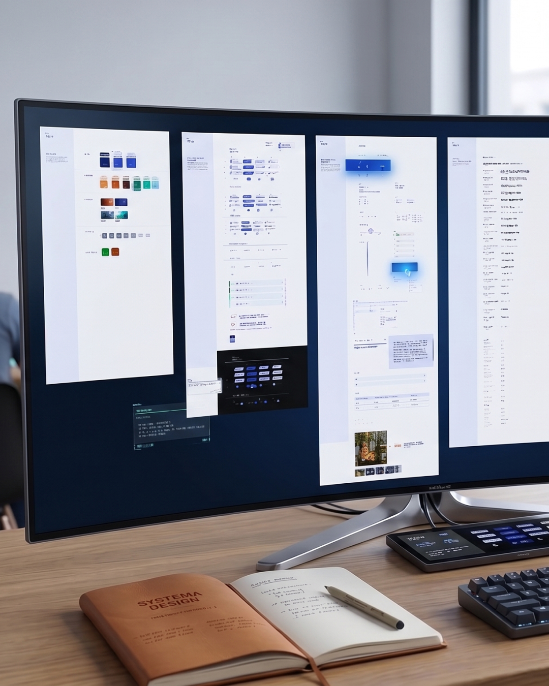
- Design System — Creation of reusable components, modules, responsive behaviours, and interaction patterns.
- Modular Experience Design — Design of a flexible content framework capable of supporting multiple page types and business needs.
- Design Leadership & Handoff — Prioritization, documentation, QA, and close collaboration with a distributed international development team.
My role connected brand direction, user experience, content requirements, and technical implementation to create a system that could scale beyond individual pages.
Challenge
Teck’s digital ecosystem needed to support a large volume of content, multiple business needs, and diverse audiences while maintaining a consistent brand and user experience.
The challenge extended beyond redesigning the interface. Replacing the entire website at once would have created unnecessary operational risk and disruption. We needed a way to transform the platform progressively while keeping the existing website available throughout the implementation.
From a design perspective, this required creating a flexible system that could coexist with the existing experience during the transition, support different content requirements, and give development teams a clear implementation roadmap.
Goals
User Goals
- See content relevant to them specifically — different visitor types (investors, communities, job seekers) needed different experiences from the same site
- Navigate a genuinely massive site (spanning global operations, sustainability reporting, investor relations, and more) without getting lost
- Experience a consistent, modern interface regardless of which module or content area they land on
Business Goals
- Update and expand the site continuously, module by module, without disruptive full-site rebuilds or "under construction" downtime
- Coordinate a scalable design system across a Vancouver creative agency, a Germany-based UI designer, and development teams in Asia and South America
- Prioritize an enormous scope realistically — using priority a framework to launch the most important areas first, avoiding a website that feels unfinished or under construction.
Product Design Approach
The direction started with the Vancouver agency's initial moodboard, which we refined together through a series of workshops to land on Teck's updated voice and visual identity. From there, I translated that direction into the actual product: designing the homepage and one inner page as reference points, then building out the full design system and handoff documentation the wider team would build from.
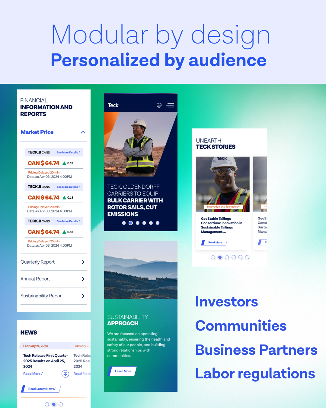
Because the site also needed to support Expresia’s hyperpersonalization technology, different users could see different content. We built the site around a modular content architecture from the start, so each module could be updated, replaced, or improved without affecting the rest of the site. This allowed the site to evolve progressively while staying live, without needing “under construction” downtime for updates.
Given the size of the website, we used an AAA → AA → A framework to decide which modules to build first. This helped us focus on the most important areas, launch them sooner, and keep the project moving instead of trying to build everything at once.
The Solution
I led the design of a flexible system that brought Teck’s new brand to life across its website.
The system was built around reusable modules rather than fixed page templates. This gave content teams greater flexibility to create different page experiences while maintaining visual consistency, responsive behaviour, and accessibility standards.
A progressive implementation model allowed the new experience to be introduced section by section. Modules were designed, documented, developed, tested, and released according to priority, enabling the platform to evolve continuously without requiring the entire website to be taken offline.
Key solutions included:
- Cross-Continental Design Collaboration — Partnered with a Vancouver agency on brand voice and visual direction, then worked with a Germany-based UI designer on implementation, bridging strategy and execution across two specialized collaborators.
- 24-Hour Global Development Cycle - Collaborated daily with development teams in Asia and South America, structuring handoffs so work continued around the clock and stayed on schedule despite the project's scale.
- Modular, Personalization-Ready Architecture - Designed a flexible content system that supported Expresia’s hyperpersonalization technology, allowing content to be updated without disrupting the live site.
- Progressive, Prioritized Delivery - Organized the massive scope using an AAA → AA → A framework, sequencing modules by business impact so the site could update quickly without a full rebuild.
- Design QA & Stakeholder Alignment - Reviewed every UI implementation against the original UX designs, handled quality assurance throughout, and stayed closely aligned with both the agency and stakeholders to keep delivery on track with the original vision.
Outcomes
The result was a design system built to scale rather than a one time redesign. By replacing fixed page templates with reusable modules, content teams gained the flexibility to build new page experiences on their own, without sacrificing visual consistency, responsive behavior, or accessibility standards.
Teck didn’t have to rebuild and launch the entire website at once. We moved sections to the new platform one at a time, based on business priorities, while the existing site stayed live. This made the transition smoother and reduced the risk of disrupting the website.
- Scalable Design System — A unified foundation of typography, colour, spacing, responsive rules, components, and interaction patterns derived from the new brand direction.
- Priority-Based Delivery — An AAA, AA, and A module classification system that aligned design and development around business importance and implementation needs.
- Progressive Platform Rollout — A modular release strategy that allowed sections of the website to transition to the new experience while the overall platform remained live.
- Clear Design Documentation — Detailed module specifications covering fields, functionality, responsive behaviour, and interaction requirements.
- Cross-Functional Implementation — Close collaboration between design and a distributed international development team to move modules efficiently from design through development and QA.
- Flexible Content Experiences — Reusable building blocks that allowed content teams to assemble different experiences without creating every page from scratch.
Project Impact
137 Reusable Modules
A modular library of 137 reusable modules was created to support consistent layouts and flexible content experiences across the new Teck website in less than two months
1.5M+Users in 7 Months
The redesigned site served more than 1.5 million users between June and December 2024.
7.67 pts ↓Lower Bounce Rate
Site-wide bounce rate decreased from 64.93% on the legacy site to 57.26% in the later 2024 period.
Continuous Platform Evolution
The progressive rollout strategy allowed the website to remain operational while sections were redesigned and migrated to the new system, avoiding the need for a complete platform shutdown during implementation.
International Collaboration
The modular system supported collaboration with a distributed development team across multiple countries. Detailed component specifications and structured handoffs created a clearer workflow between design, development, implementation, and QA.



Related Work



Let’s Talk