Finesse by Alpina

Overview
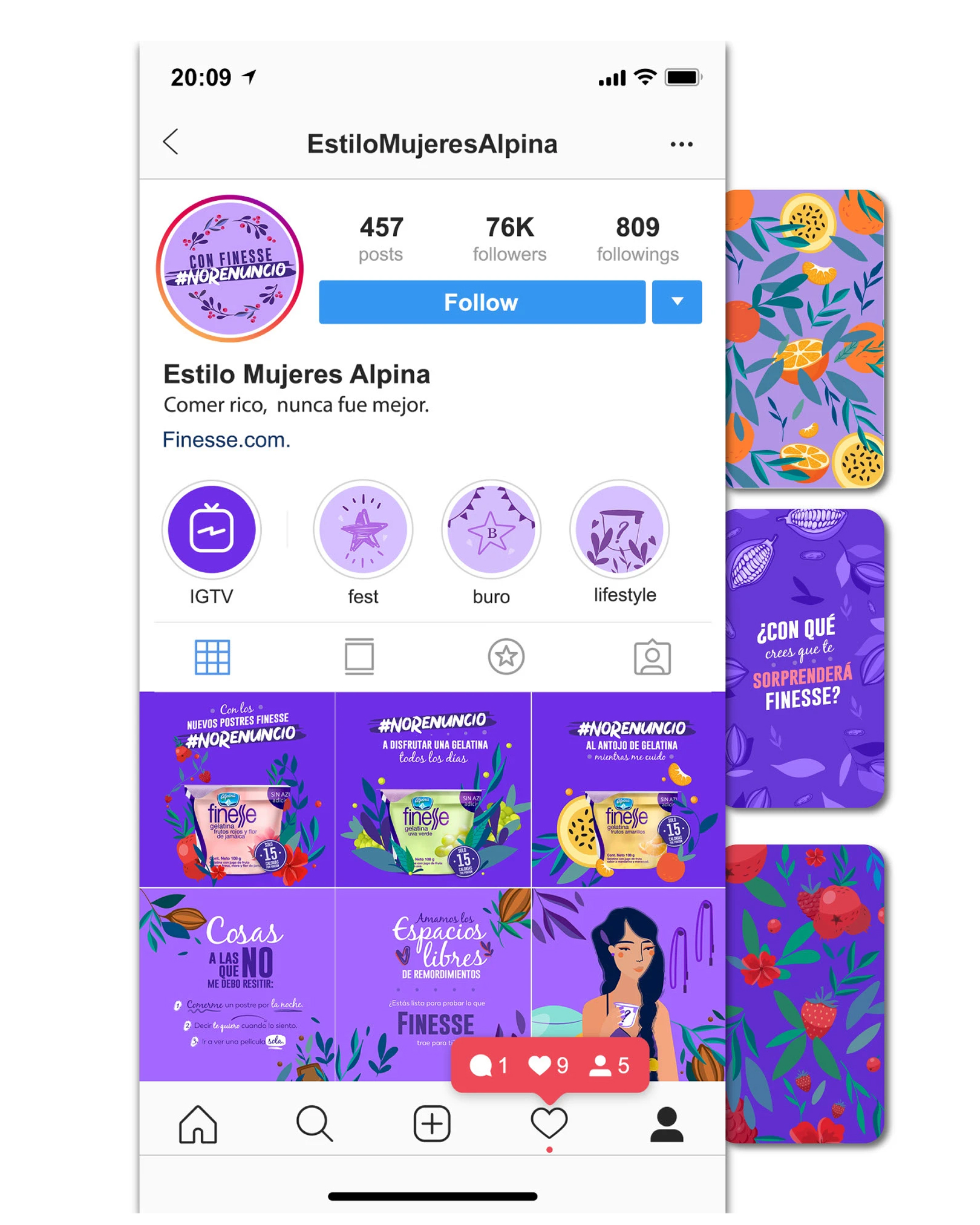
Finesse, a wellness-focused sub-brand of Alpina, launched No Renuncies, a digital campaign designed to inspire women to prioritize their wellbeing, embrace personal growth, and pursue their goals without giving up on themselves.
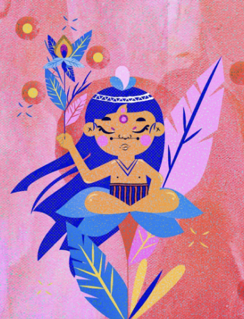
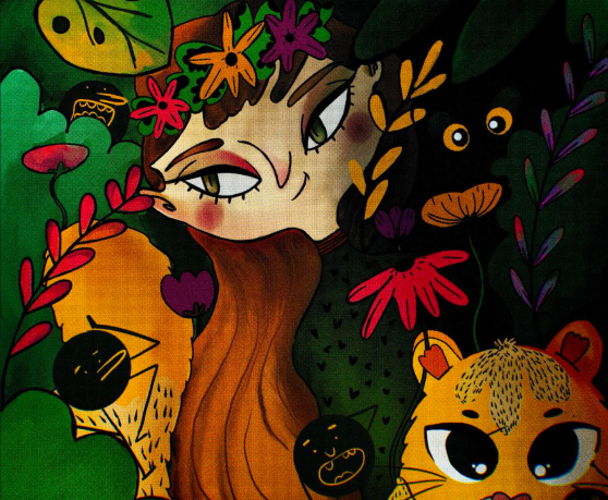
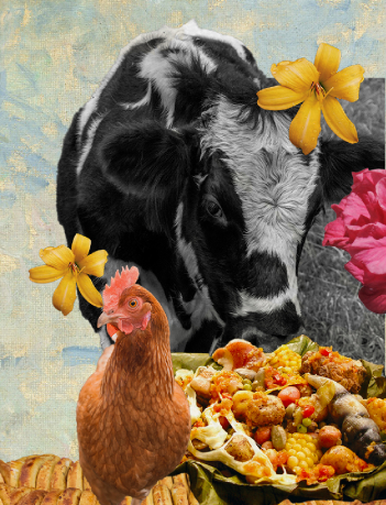
I was responsible for creating the campaign's illustration language, developing a series of custom illustrations that transformed inspirational messages into vibrant visual stories. Beyond producing the artwork. I collaborated on the campaign's creative direction, ensuring every illustration worked cohesively across social media while reinforcing the campaign's optimistic and empowering voice.
Key Services & role
Role: Lead Illustrator & Visual Designer
Key Services Provided
- Campaign Illustration: Designed original illustrations that visually communicated campaign concepts while reinforcing the personality of the brand.
- Visual Storytelling: Created expressive scenes and characters that transformed marketing messages into relatable visual experiences.
- Marketing Assets: Adapted illustrations into flexible visuals for social media, promotional materials, and digital communications.
Challenge
The success of No Renuncies depended on creating content that people would genuinely connect with in crowded social feeds. The challenge wasn't simply illustrating characters. It was building a visual language capable of expressing motivation, confidence, and everyday moments in a way that felt authentic rather than promotional.
Each illustration needed to support different campaign messages while remaining visually consistent, instantly recognizable, and flexible enough to live across multiple digital formats.
Goals
User goals
- Build a memorable visual identity for the No Renuncies campaign.
- Increase engagement through original illustration-led content.
- Strengthen Finesse's emotional connection with its audience.
- Create reusable visual assets that could support the campaign across multiple digital channels.
Business goals
- Feel inspired by relatable stories and positive messages.
- Connect emotionally with the campaign through expressive illustrations.
- Easily recognize Finesse's visual identity across different content.
- Enjoy content that feels authentic, optimistic, and worth sharing.
Creative approach
Rather than treating each illustration as an individual piece, I approached No Renuncies as a visual storytelling system. Every character, composition, and color choice was designed to reinforce the campaign's message while creating a cohesive identity that audiences could instantly recognize.
The creative direction focused on balancing warmth, optimism, and expressiveness, allowing the illustrations to communicate emotion while remaining flexible across social media posts, stories, and promotional assets.
Project Solutions
No Renuncies - nothing to give up needed illustration to do more than decorate motivational captions — it needed to carry the emotional weight of the message itself. My focus was building a visual system flexible enough to support dozens of different moments and messages while staying instantly recognizable as Finesse.
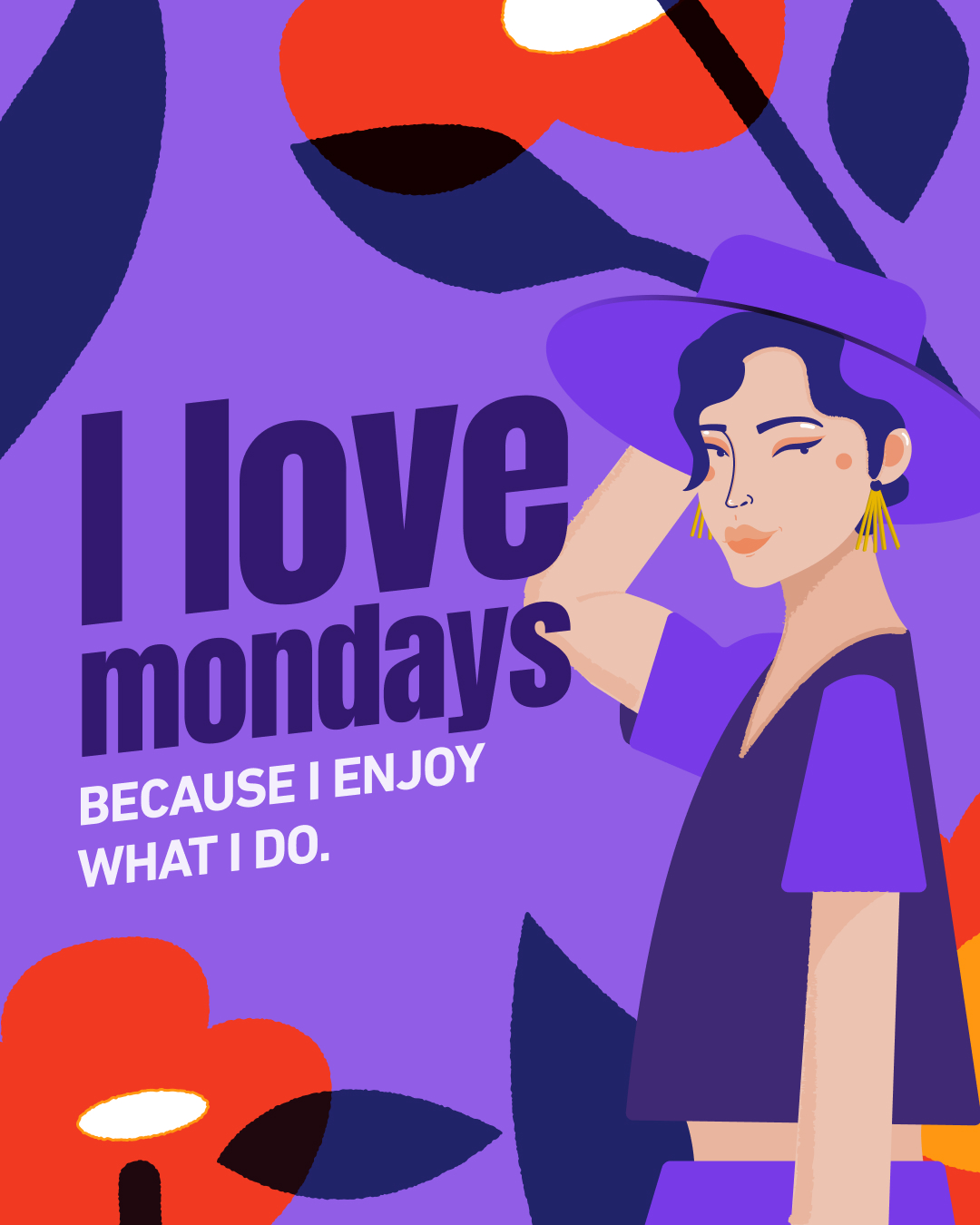
Illustration System — Developed a flexible library of characters, scenes, and compositions that could be recombined and adapted across a wide range of campaign messages without losing visual consistency.
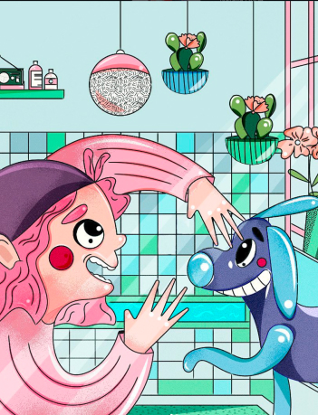
Character-Led Storytelling — Designed relatable female characters shown in everyday moments — getting ready, chasing a goal, taking a breath — so the illustrations felt like scenes from real life rather than generic stock imagery.
Format Flexibility — Built each illustration to adapt across feed posts, Stories, and Reels covers, ensuring the campaign's visual identity held up across every placement.
Color & Tone System — Established a consistent purple-driven palette and confident hand-lettered typography that reinforced Finesse's optimistic, empowering voice at a glance.
The result: an illustration-led campaign that made No Renuncies instantly recognizable in-feed, strengthened Finesse's emotional connection with its audience, and proved illustration could outperform product-first content on engagement.
Why this project matters
Finesse demonstrates how illustration can function as brand strategy, not just decoration. Rather than treating each piece as a standalone asset, I built a visual system that gave No Renuncies a consistent, recognizable voice across dozens of messages and formats — one that resonated enough to outperform product-first content and drive real engagement. The project reflects my approach to illustration as a storytelling tool that has to work as hard as copy does to build an emotional connection with an audience.
Outcomes
The project resulted in a cohesive illustration system that became the visual foundation of the No Renuncies campaign. By combining consistent art direction with emotionally driven storytelling, the campaign created a recognizable identity that supported engagement across Finesse's digital channels.
Campaign Impact
355K+
Views on the campaign's highest-performing Reel.
40K+
Likes on the top-performing illustrated campaign post.
Illustrated storytelling consistently outperformed product-first content, demonstrating the effectiveness of illustration as a tool for increasing engagement and strengthening brand recognition.


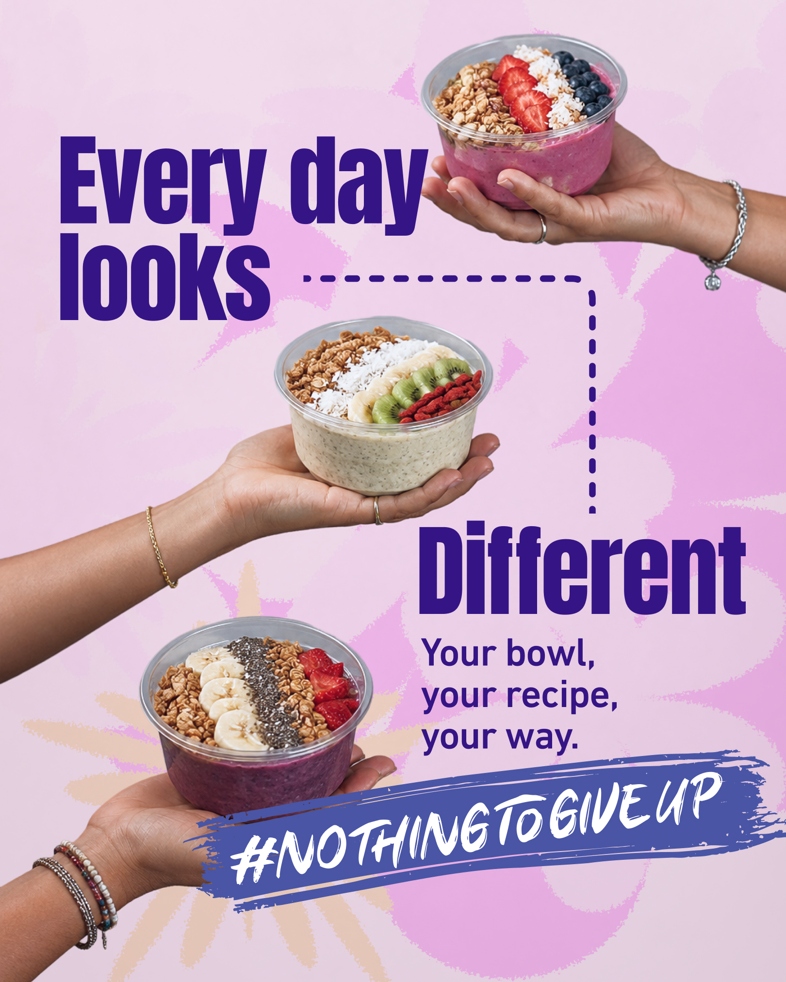
Related Work


Let’s Talk