BeitAvot

Overview
Beit Avot is a senior living community within the Pepeganga Group, created to provide a safe, welcoming, and enriching environment for older adults in the Jewish community. The project focused on developing a visual identity that reflected the organization's values while communicating professionalism, warmth, and trust to residents, families, and caregivers.
As Lead Brand Designer, I created a comprehensive identity system that extended beyond the logo to include typography, color, printed materials, editorial layouts, and branded applications. The goal was to build a consistent visual language that strengthened communication across every touchpoint while creating a reassuring and approachable brand experience.
Key Services & Role
Role: Lead Brand Designer
Key Services Provided
- Brand Strategy — Defined a visual direction that reflected the organization's mission, values, and sense of community.
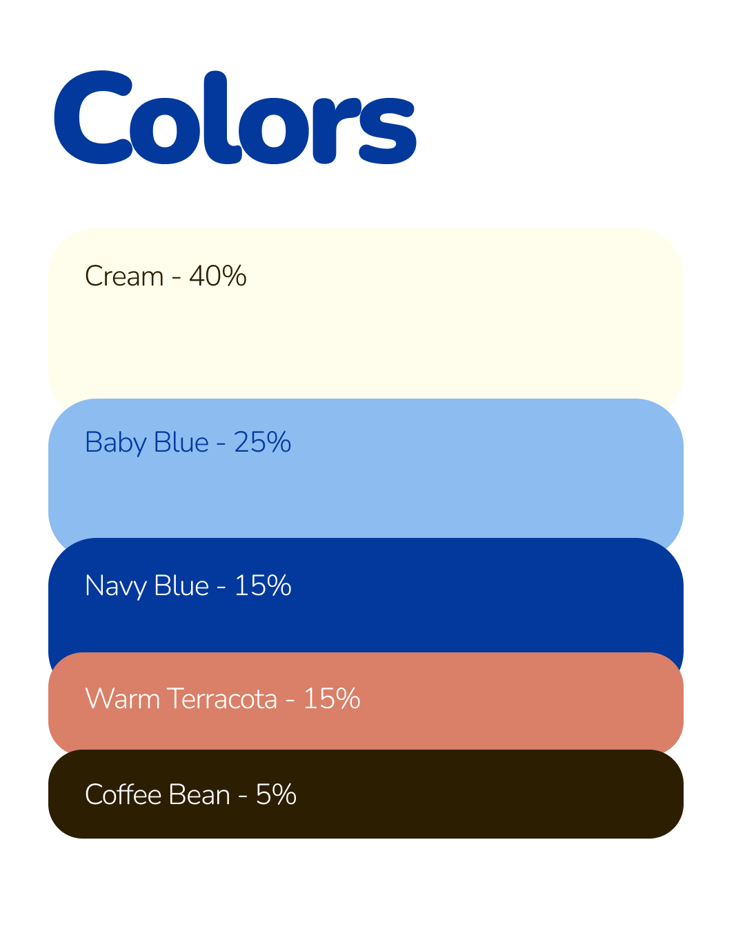
- Visual Identity — Designed the logo, typography, color palette, and graphic system to establish a recognizable and timeless brand.
- Editorial Design — Created printed communication materials with a focus on readability, hierarchy, and accessibility.
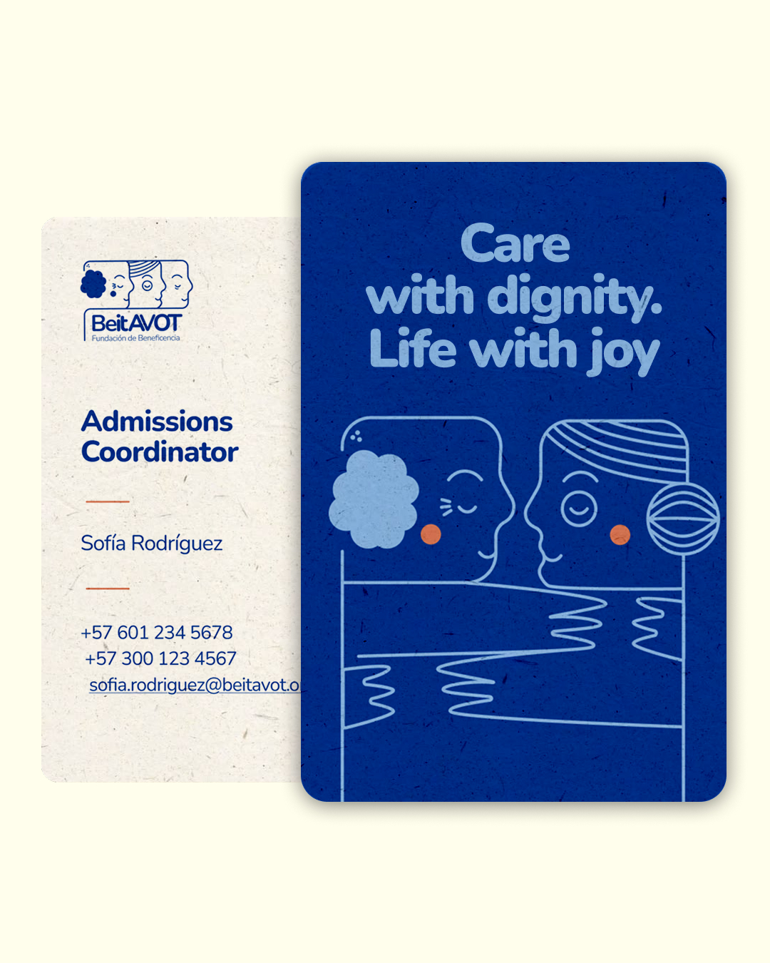
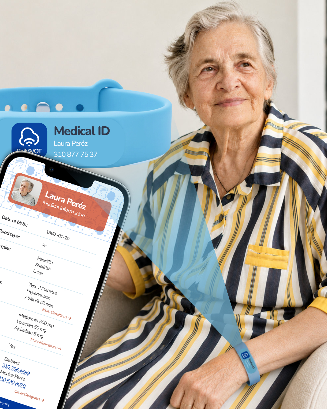
- Brand Applications — Extended the identity across stationery, marketing materials, signage, and digital touchpoints to ensure a consistent brand experience.
Throughout the project, I focused on creating a flexible identity system that balanced professionalism with warmth, allowing the brand to communicate clearly across both print and digital media.
The Challenge
Senior living communities must inspire confidence while remaining approachable and welcoming. The challenge was to create a visual identity that communicated care, dignity, and professionalism without relying on the clinical or institutional aesthetics often associated with healthcare organizations.
The brand also needed to speak to multiple audiences—including residents, families, caregivers, and the wider community—while maintaining consistency across a variety of printed and digital materials.
Goals
User goals
- Establish a recognizable and trustworthy brand identity.
- Create consistent communication across print and digital touchpoints.
- Reflect the organization's values of care, community, and respect.
- Develop a flexible visual system that could grow with the organization.
Business goals
- Instantly recognize and trust the organization.
- Access information through clear and accessible communication.
- Feel welcomed by a warm and approachable visual identity.
- Build confidence in the services provided by the community.
Brand Approach
The identity was built around the idea that thoughtful design can create trust and a sense of belonging. Every element, from typography and color to layouts and graphics, was designed to feel clear, warm, and professional.
The system was also designed to be flexible and consistent, allowing the brand to work across print, editorial, environmental graphics, and digital communications while keeping a unified look and feel.
Project Solutions
I approached Beit Avot as an opportunity to create more than a visual identity. My goal was to build a brand system that reflects the organization's values while improving how people experience the brand across every interaction.
My approach focused on:
- Brand Strategy — Defining a visual language that communicates warmth, trust, and community.
- Visual Identity — Creating a cohesive system of typography, color, and graphic elements that supports consistent communication.
- Brand Applications — Extending the identity across editorial materials, signage, stationery, and digital touchpoints to create a unified experience.
The result is a timeless brand identity that strengthens recognition, improves communication, and provides Beit Avot with a scalable system designed to support future growth.
Outcomes
The project resulted in a cohesive brand identity that helped Beit Avot communicate its mission with greater clarity and consistency. The visual system provided a strong foundation for future communications while creating a welcoming brand experience that reflected the organization's commitment to care, respect, and community.



Related Work



Let’s Talk