NBS
Overview
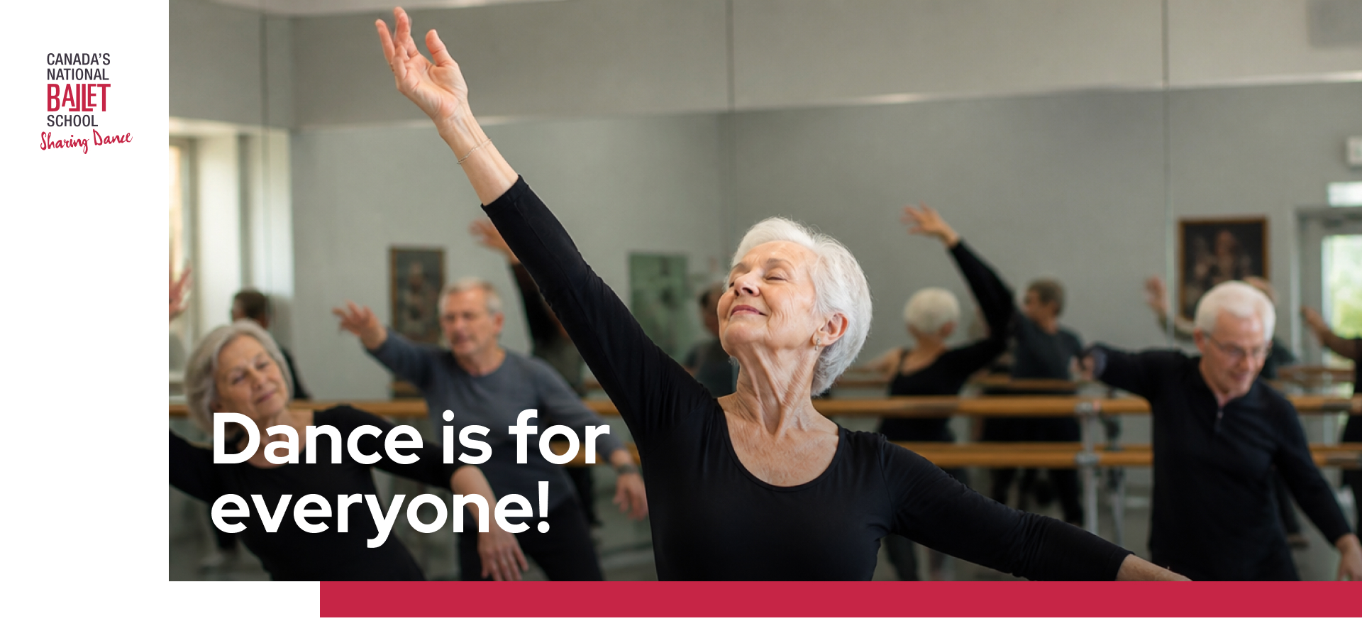
Canada’s National Ballet School set out to redesign its digital dance experience for older adults, creating a platform where users could easily discover and participate in on-demand and live dance classes.
The UX -UI challenge went beyond creating a video library. The audience included users with different mobility needs, language preferences, visual needs, and levels of digital confidence. Some users were comfortable navigating digital products independently, while others needed support with fundamental interactions such as playing a video, entering fullscreen mode, or recovering a password.
From a UX/UI perspective, the project focused on reducing cognitive load, simplifying content discovery, and creating clear paths into the experience. Rather than exposing users to a large catalog of choices, the platform was structured around a small number of meaningful decisions that progressively guided users toward relevant classes.
The result was an accessible and personalized video experience designed around how this specific audience discovers content, makes decisions, and builds confidence with digital tools.
Key Services Provided
Role: Lead Product Designer (UI Lead & UX Governance)
I led the UX/UI design direction for the platform, overseeing the experience from discovery and information architecture through interface design, validation, documentation, and implementation.
As Lead Designer, I worked directly with stakeholders and the development team to translate business requirements and user needs into a clear product experience. I also guided and reviewed the UX work produced by other designers, ensuring that user flows, interaction patterns, and interface decisions remained aligned with the overall product strategy, accessibility requirements, and design system.
My responsibilities included:
- UX/UI Design Leadership
- UX Strategy & Experience Direction
- Design Review and UX Quality Assurance
- Information Architecture
- User Flow and Interaction Design
- Accessibility Design
- UI Design and Design System Direction
- Prototyping and Experience Validation
- Stakeholder Collaboration
- Design-to-Development Handoff
- Direct Collaboration with Developers
- Implementation Review and Design QA
The Challenge
The main UX challenge was designing a streaming experience for an audience with a particularly wide range of digital confidence and accessibility needs.
The existing experience exposed users to multiple rows of video content at once. Through stakeholder discovery, we learned that this could make finding a class difficult and overwhelming. The goal was not to add more ways to browse, but to reduce unnecessary decisions and help users reach relevant content faster
At the same time, the experience needed to support users with different mobility preferences, program goals, and language needs without creating a complicated filtering system. NBS specifically wanted to avoid over-classifying content because too many options could make decision-making harder for the audience.
The UX also needed to account for fundamental usability barriers. During discovery, the NBS team described situations where users required assistance with actions as basic as pressing Play or entering fullscreen mode. This reinforced the need to make core interactions explicit, recognizable, and easy to access.
The key UX challenges were:
- Reducing cognitive load during content discovery
- Designing for a wide range of digital literacy
- Supporting seated and standing participation
- Supporting English and French content
- Making video controls and key actions highly visible
- Creating simple pathways through progressive programs
- Supporting returning users migrating from an existing platform
- Simplifying registration, login, and password recovery
- Balancing personalized recommendations with user control
- Creating an accessible experience across desktop, tablet, and mobile
- Designing an intuitive CMS experience for the NBS team
Goals
User Goals
- The UX strategy focused on helping users:
- Find an appropriate class without navigating a large content library
- Understand whether a class matched their mobility preferences
- Choose between shorter and progressive programs
- Access content in English or French
- Easily understand how to start and control a video
- Continue a progressive program without searching for the next class
- Save and return to preferred content
- Discover live events and recommended activities
- Access support when they encounter problems
- Adjust accessibility preferences such as text size and contrast
Business Goals
- Create a scalable video experience for the older adult program
- Improve participation and continued engagement
- Support content discovery through personalized preferences
- Allow NBS to curate recommendations rather than relying only on automated suggestions
- Simplify video and event management for internal teams
- Provide visibility into engagement and video performance
- Support the migration of existing users
- Create stronger connections between participants and the broader NBS community.
Product Design Approach
As Lead UX/UI Designer, I guided the product design process from discovery through implementation. My role involved defining the experience direction, reviewing UX flows and design decisions across the team, and working directly with developers to ensure that the intended experience was translated accurately into the final product.
The design process began with stakeholder discovery to understand the audience, existing pain points, content structure, and the ways older adults interacted with the program. These insights informed the information architecture and helped the design team focus on reducing cognitive load, improving accessibility, and simplifying content discovery.
Throughout the project, I reviewed the UX work developed by other designers, helping maintain consistency across user journeys and ensuring that decisions remained grounded in the needs identified during discovery. I also worked closely with developers throughout implementation, reviewing interactions, responsive behavior, accessibility considerations, and design consistency.
UX Solutions
Guided Class Discovery
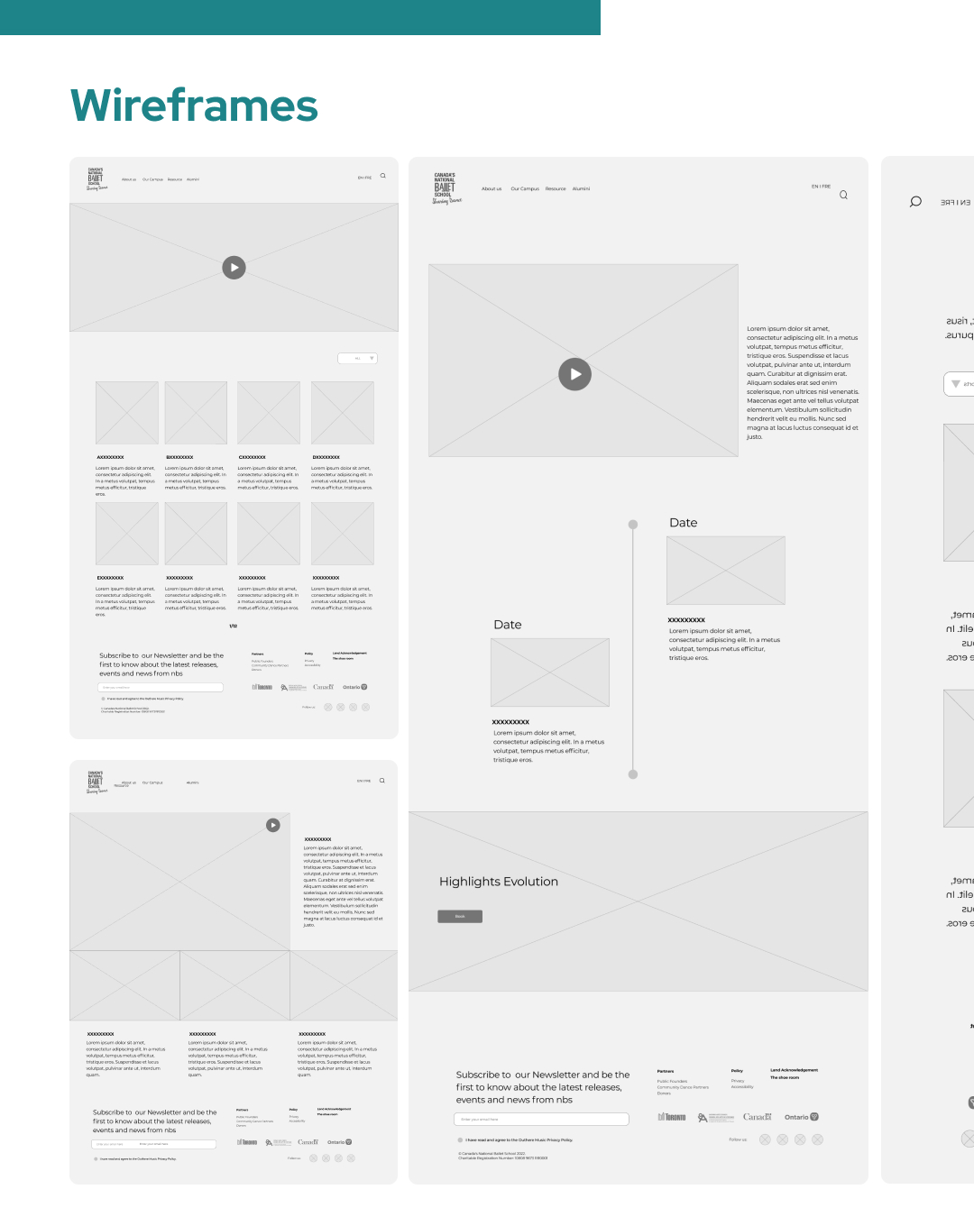
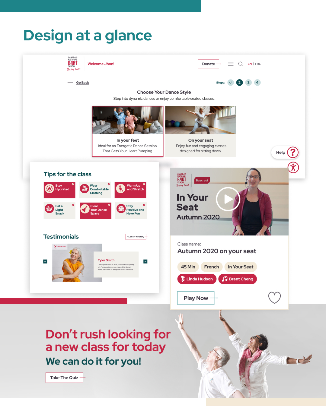
Instead of presenting the entire video catalog immediately, the experience used progressive disclosure to help users make one decision at a time.The discovery flow focused on duration, mobility, and language, allowing the interface to reduce the number of irrelevant options before presenting content.
This transformed content discovery from:
Browse everything → compare → decide
into:
Express a preference → see relevant options → choose a class
The approach responded directly to stakeholder feedback that showing all available content at once could feel overwhelming and make it harder for users to decide what to watch.
- Accessible Video Experience - the video page was designed around the most important task: helping users start and complete a class successfully. Discovery revealed that even familiar video-player conventions could not be assumed to be universally understood. For that reason, key actions such as Play and Fullscreen were considered as explicit interface actions rather than relying exclusively on controls embedded within the video player.
- Progressive Learning Paths - the experience supported both independent classes and structured progressive programs.For progressive programs, the UX needed to clearly communicate sequence and progression. Instead of forcing users to return to search after completing a class, the interface could surface the appropriate next class while still requiring an intentional action from the user. This was particularly important for a physical activity platform: recommendations needed to encourage continued participation without automatically playing another long dance class or encouraging overexertion.
- Curated Recommendations - recommendations were designed as a balance between personalization and editorial control. User preferences helped surface relevant content, while NBS retained control over daily recommendations, live events, and suggested next classes. This allowed the platform to create a personalized experience without depending entirely on algorithmic recommendations.
- Accessible Account Experience - the discovery process identified password recovery as one of the most significant recurring pain points. Users could become blocked when password reset emails were missed or sent to junk folders, creating frustration and additional support requests.
- Familiar Event Discovery - a calendar experience was explored as a familiar way for users to discover live classes, events, and recommended activities. The design considered the different contexts in which a calendar works well. On larger screens, users could understand events within a broader calendar structure, while smaller screens required a more focused presentation to preserve readability and avoid compressing information into an inaccessible interface.
Solutions
Rather than exposing users to a large catalog of videos, I helped design a guided discovery experience that progressively narrowed content based on a few meaningful decisions—class duration, mobility level, and language preference. This reduced cognitive load and made finding the right class feel significantly less overwhelming for older adults.
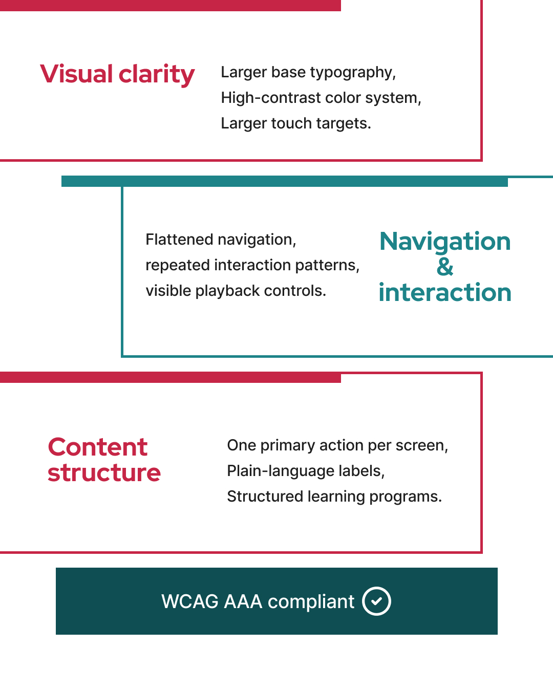
Accessibility influenced every stage of the experience, not just typography and contrast. We simplified navigation, made critical actions highly visible, improved account flows, and reduced unnecessary complexity to support users with different levels of digital confidence and physical ability.
Research revealed that some users struggled with fundamental digital interactions, such as playing videos or navigating fullscreen mode. The interface was designed to build confidence through familiar interaction patterns, clear affordances, and explicit guidance rather than assuming prior technical knowledge.
Instead of treating every class as an isolated video, the experience organized content into structured learning journeys. Users could easily continue progressive programs while still maintaining control over what they watched next, encouraging long-term engagement without creating unnecessary friction.
Outcomes
The final experience transformed a complex content ecosystem into a guided and accessible digital experience designed specifically around the needs of older adults.
From a UX/UI perspective, the project established a clearer relationship between user needs, content architecture, and interface behavior.
The resulting experience:
- Reduced the number of decisions required to discover a class
- Created clearer pathways between independent and progressive programs
- Supported different mobility preferences without creating a complex navigation system
- Made fundamental video interactions more explicit
- Integrated accessibility into navigation, account flows, and content discovery
- Balanced personalization with NBS-curated recommendations
- Connected on-demand content with live events and community participation
- Created a manageable content structure for internal teams
- Established a scalable foundation for future program growth
The project demonstrates how accessibility can shape the entire product strategy—not only typography, contrast, and component design, but also information architecture, content strategy, interaction patterns, and the number of decisions users are asked to make.
UX Scope & Complexity
8 Content Pathways
A flexible class system designed around duration, mobility needs, and language, allowing users to follow a 6-week progressive program that fits their needs.
33 User Stories
The platform was shaped around 33 user stories covering 5 different user roles, from older adults and activity coordinators to content managers and administrators.
107+ QA Test Cases
The experience was tested across roughly 13 platform flows, including registration, migration, preferences, video playback, profiles, and help.


Related Work



Let’s Talk