Kranon
Overview
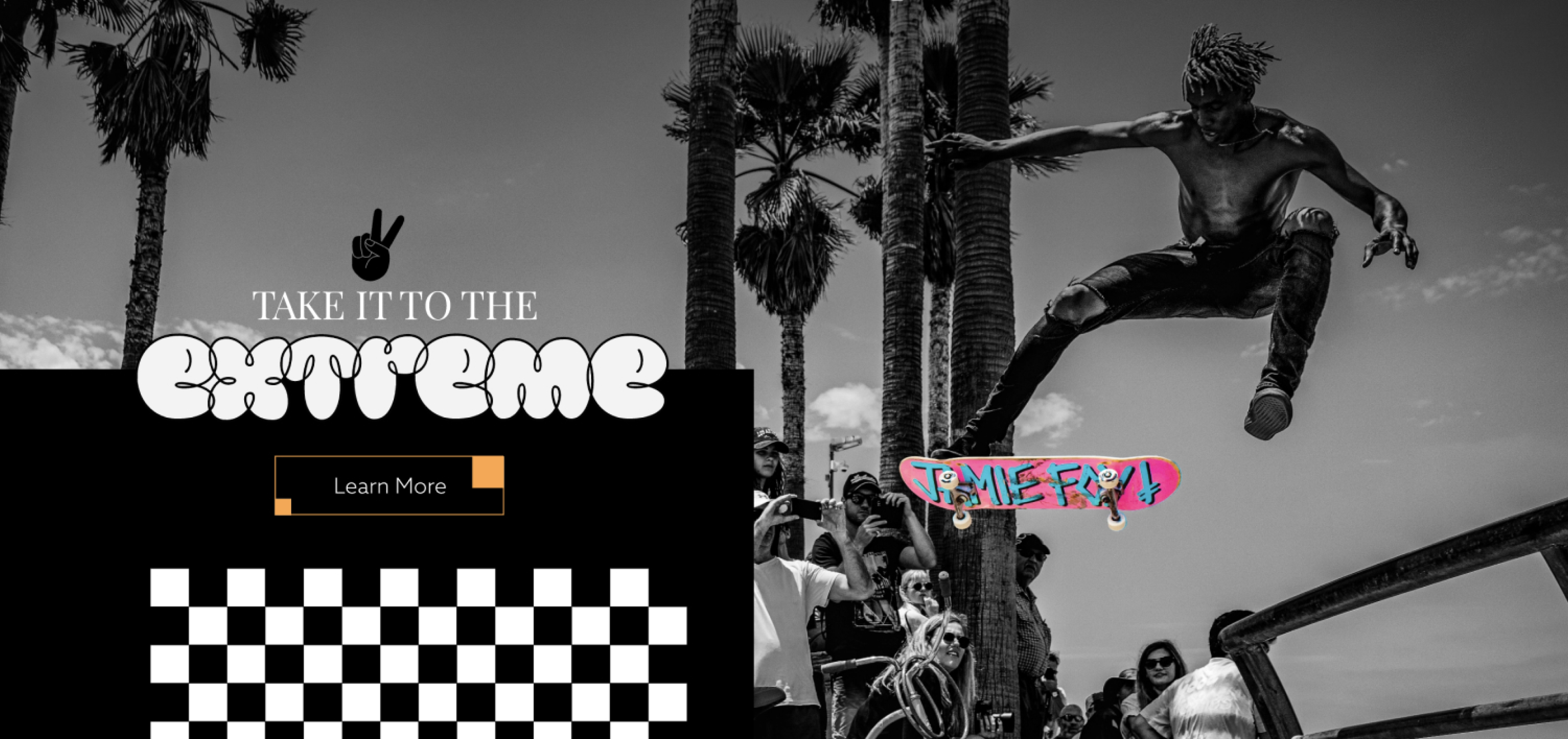
Kranon is a conceptual skateboard brand inspired by the creativity, individuality, and rebellious spirit of skate culture. The project explored how one brand could connect with different personalities through illustration while maintaining a recognizable identity across products, merchandise, and digital touchpoints.
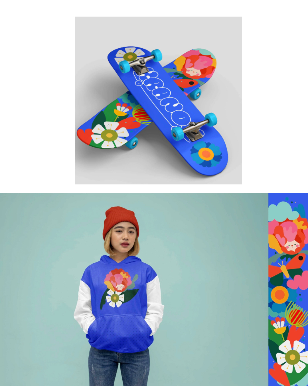
I developed three original skateboard directions, each with its own visual personality but connected through a shared brand language. The project expanded into apparel, marketing assets, and an e-commerce prototype, followed by user testing with 10 participants to evaluate brand recognition, product preference, and the clarity of the shopping experience.
Key Services Provided
Role: Lead Brand Designer
- Brand Strategy — Defined the concept, audience profiles, personality, and creative direction for the brand.
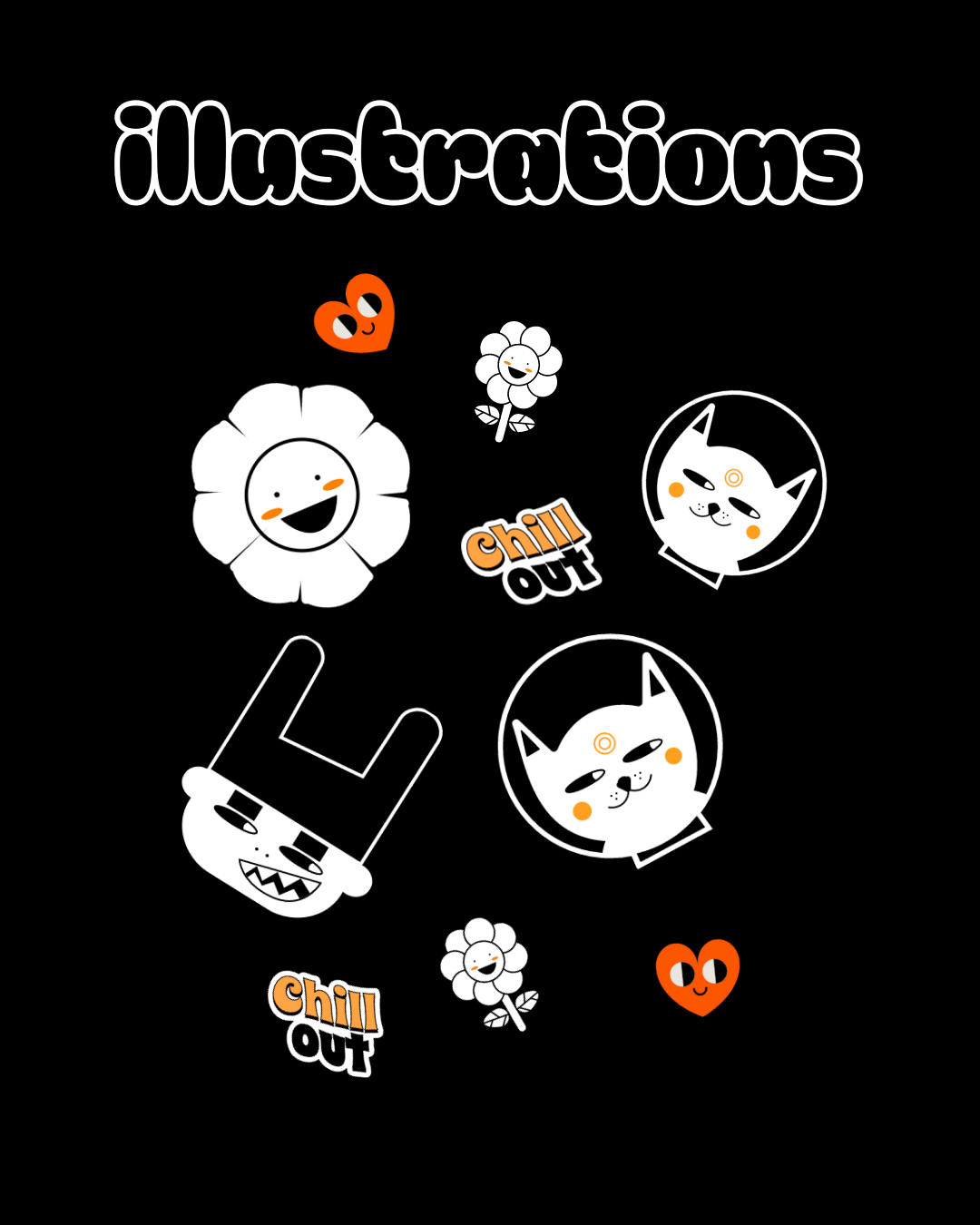
- Illustration Design — Created three original skateboard directions with distinct visual personalities.
- Brand Identity — Developed the logo, typography, color system, and supporting visual language.
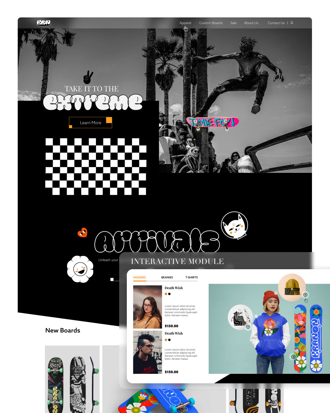
- UI Design & Prototyping — Designed an e-commerce prototype for browsing and discovering the collections.
- Brand Applications — Extended the identity across apparel, social media, and promotional materials.
- User Testing — Tested brand perception, collection differentiation, and key shopping tasks with 10 participants.
Every illustration was designed to strengthen the brand story while creating a cohesive visual system across both physical products and digital experiences.
The Challenge
Skate culture is built around individuality and self-expression, which made the main challenge more complex than simply creating a consistent visual style. Kranon needed to feel like one recognizable brand while giving different personalities room to connect with different products.
The challenge was to build enough variation between the three skateboard directions for each to feel distinctive, without making them feel like products from unrelated brands. The digital experience also needed to bring those collections together and make it easy to explore the artwork and understand the differences between them.
Goals
Brand Goals
- Build a Recognizable Identity — Create a clear visual foundation that connects different artistic directions under one brand.
- Support Different Personalities — Develop three distinct deck directions designed around different forms of self-expression.
- Create a Flexible Brand System — Extend the identity consistently across skateboards, apparel, marketing, and digital touchpoints.
- Validate the Concept — Understand whether people perceived the collections as distinct while still recognizing them as part of Kranon.
User Goals
- Find a Personal Connection — Discover skateboard graphics that reflect individual tastes and personality.
- Understand the Collections — Easily recognize the differences between the three visual directions.
- Explore Products Easily — Browse the collections and find product information without unnecessary friction.
- Connect with the Brand — Experience a visual identity that feels expressive, creative, and connected to skate culture.
Product Design approach
I approached Kranon around one central question: How different can three product collections feel while still belonging to the same brand?
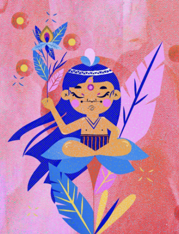
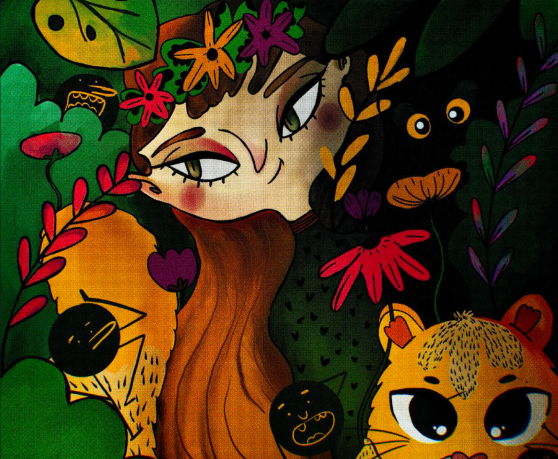
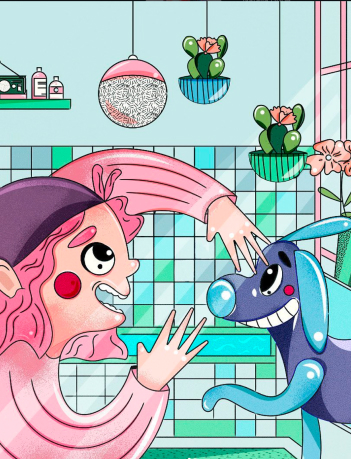
Instead of repeating one illustration style across every deck, I created three distinct visual directions based on different audience personalities. The shared identity, typography, art direction, and brand voice acted as the connective layer between them.
The concept was then extended into apparel and a digital shopping prototype. To evaluate whether the system worked as intended, I structured testing with 10 participants around three areas: collection differentiation, overall brand recognition, and the ability to browse and understand the products within the e-commerce experience.
Testing & Validation
The concept was evaluated with 10 participants through a combination of brand perception and usability tasks. Participants explored the three skateboard directions, described the personality they associated with each one, selected the collection they connected with most, and completed key browsing tasks within the e-commerce prototype.
In this hypothetical scenario, the results would show that participants could distinguish the personalities of the three collections while still recognizing them as part of the same brand. Testing would also identify smaller opportunities to improve collection naming, product information hierarchy, and the visibility of key shopping actions.
Project Solutions
Kranon was built around the idea that a skate brand does not need to rely on one repeated graphic style to feel consistent. Instead, I created a shared brand foundation that allowed three different visual personalities to exist within the same system.
My process focused on:
- The result is a flexible brand system that uses illustration as a tool for audience connection while maintaining a recognizable identity across physical and digital experiences.
- Audience-Inspired Art Direction — Translating different personalities into three distinct visual directions.
- Illustration System — Creating original deck artwork with enough variation to support individual expression.
- Shared Brand Identity — Using typography, identity elements, art direction, and tone to connect the collections.
- Physical-to-Digital Consistency — Extending the brand from skateboard decks and apparel into an e-commerce prototype.
- Testing & Refinement — Evaluating whether people understood the differences between the collections, recognized the shared brand, and could navigate the shopping experience.
The result is a flexible brand system that uses illustration as a tool for audience connection while maintaining a recognizable identity across physical and digital experiences.
Outcomes
The project resulted in a complete conceptual skateboard brand built around three distinct illustration directions, a flexible visual identity, merchandise applications, and a cohesive e-commerce prototype.
The validation phase helped test the central idea behind the project: that a single brand could support different forms of visual expression without losing recognition. Feedback from 10 participants would confirm that the collections felt distinct while still belonging to the same brand system, while usability findings would guide refinements to product discovery and information hierarchy.
The result is a more complete brand concept that connects strategy, illustration, physical products, and digital experience around a clear idea: self-expression can create variety without sacrificing identity.



Related Work


Let’s Talk