JA Studio
Overview
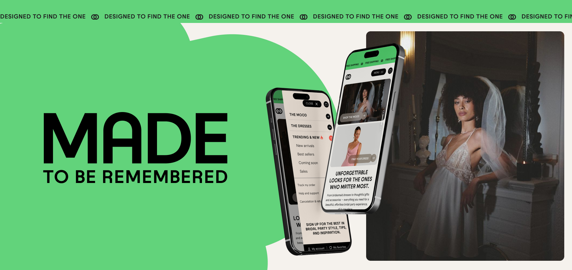
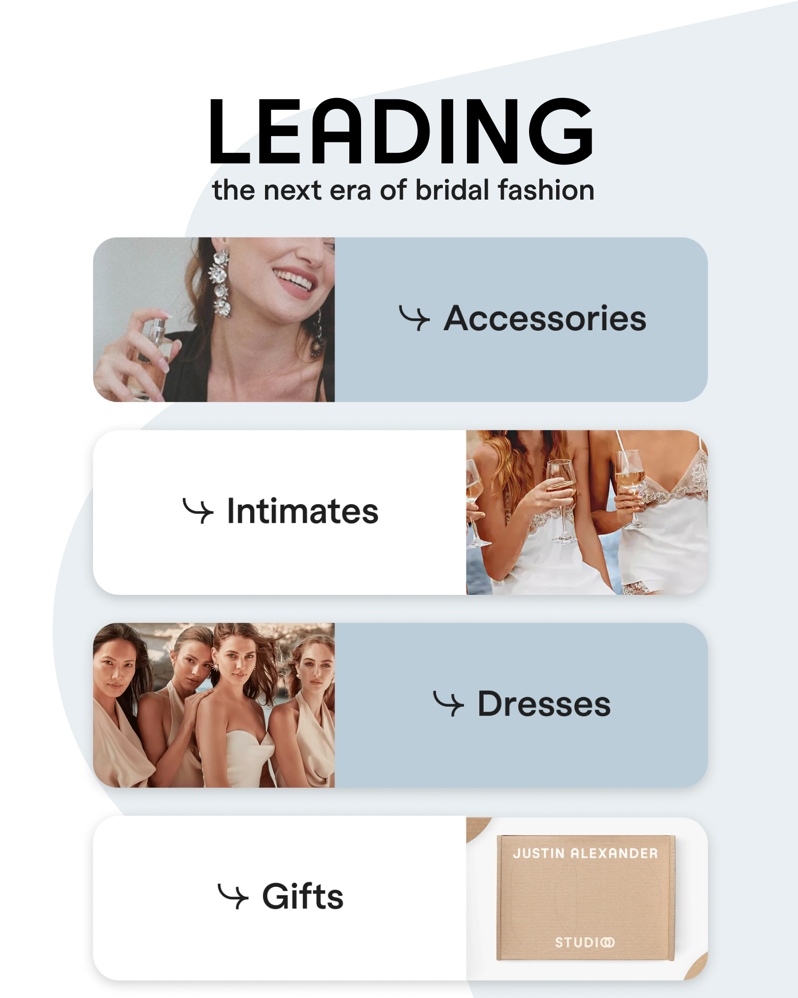
Justin Alexander Studio is the bridal party companion to Justin Alexander's main gown collections, a space where brides and their parties can shop everything beyond the dress itself. The Studio offers Ready-to-Order pieces like robes and accessories, alongside Made-to-Order bridesmaid dresses with thousands of possible configurations, plus bridal lingerie and intimates.
The product itself was strong, but the existing Studio experience wasn’t converting as well as the business expected. Instead of guessing what needed to change, we first focused on understanding the problem. We conducted a heuristic evaluation and user testing to identify where users were struggling and why.
The project was paused before launch as the client addressed issues with the underlying product offering.
Key Services Provided
Role: Lead Product Designer (UI Lead & UX Governance)
I led the creative direction for the redesign, starting with the homepage and a key inner page to set the overall visual and interaction direction for the rest of the UI team.
From there, I reviewed the team’s UX and UI work before it went to the client, helping make sure everything felt consistent and met the project’s quality standards. I presented concepts and design decisions directly to stakeholders and worked closely with developers, the project manager, and UX designers throughout the project to make sure the design worked for both the business and the technical side.
- Product Design Leadership
- UI Design & Visual Direction
- UX Oversight & Final Design Approval
- Interaction Design
- Design System Development
- Responsive Design
- Prototyping
- Developer Collaboration & Handoff
- Design QA
The Challenge
Shopping for bridesmaid dresses, lingerie, and accessories is different from shopping for the main wedding dress. It often involves multiple people making decisions together around style, color, and fit for the same event.
The existing Studio experience wasn’t designed to handle that complexity well. Through a heuristic review and user testing, we found issues with navigation, inconsistencies between the Ready-to-Order and Made-to-Order experiences, and points where users dropped off instead of continuing toward a purchase.
The challenge was to fix the specific issues the research uncovered, while defining a visual and interaction language consistent enough for a multi-designer team to execute without drifting from the concept.
Client Goals
User Goals
- Move easily between Ready-to-Order and Made-to-Order paths without confusion
- Understand product options (bridesmaid dresses, lingerie, accessories) at a glance
- Experience a consistent, polished interface across the whole Studio
- Progress from browsing to ordering with fewer drop-off points
Business Goals
- Fix the specific usability issues identified through heuristic evaluation and user testing
- Improve conversion across both Ready-to-Order and Made-to-Order journeys
- Establish a consistent design language multiple designers could build from
Product Design Approach
The process started with a discovery phase that included several workshops with stakeholders, along with a heuristic evaluation and user testing to understand where the existing Studio experience was falling short for users. These findings helped guide the design decisions that followed.
From there, I developed the creative concept for the homepage and a key inner page, setting the visual direction, layout, and interaction patterns for the redesign. This included finding a clear way to present the Ready-to-Order and Made-to-Order options within the same experience.
These two pages became the foundation for the rest of the UI team, giving them a clear reference to follow as they designed and built the remaining pages.
Throughout the project, I presented the concept and key decisions directly to stakeholders, incorporating feedback while protecting the core UX logic the research had pointed to. In parallel, I reviewed every UX and UI solution produced by the design team, giving final approval before anything was shown to the client.
The approach focused on four principles:
- Diagnose before designing - We started with stakeholder workshops, a heuristic evaluation, and user testing to understand where and why the existing Studio experience was underperforming.
- Unify two distinct shopping paths - Ready-to-Order and Made-to-Order follow different decision-making patterns. The concept had to present both clearly within one cohesive experience, without forcing bridesmaid dresses, lingerie, and accessories into a single generic template.
- Concept first, scale second - Rather than designing every page individually, I created the concept for the homepage and one key inner page. Establishing the visual language and interaction patterns the rest of the UI team could apply consistently across the remaining pages.
- Validate before it reaches the client - Every UX and UI solution from the design team passed through my review before stakeholder presentation, keeping the delivered experience aligned with both the research findings and the approved creative direction.
Project Solutions
Our solution centered on creating a scalable, user-friendly experience that balanced customer needs with business requirements.
The solution focused on:
- Research-Led Redesign - Used user testing and research to identify and fix the key issues affecting performance.
- Creative Concept & Direction - Designed the homepage and one key inner page as the reference concept, giving the UI team a consistent visual and interaction language for both Ready-to-Order and Made-to-Order journeys.
- Cross-Functional Collaboration - Worked directly with the project manager, and UX designers throughout delivery, presenting to stakeholders and translating feedback into design decisions without losing the research-backed direction.
- Design Review & Approval - Reviewed and approved UX and UI solutions from the broader design team before client presentation, maintaining consistency across a multi-designer effort.
Outcome
The redesign improved the clarity and usability of a complex customization experience, while creating a stronger visual foundation for future development.
- Supported over 4,000 possible configurations for customizable dresses.
- Reduced interface complexity through reusable interaction patterns.
- Created a scalable UI foundation capable of supporting future product expansion.
- Established consistent design standards across customer-facing experiences.
- Documented and addressed key UX and visual issues through testing and evaluation.
Project Impact
4,000+ configurations
Each customizable dress could have more than 4,000 possible combinations, highlighting the complexity of the product and configurator experience.
< 2 Weeks
A made-to-order process designed to get customized dresses from order to delivery in less than two weeks.



Related Work



Let’s Talk