Finesa
Overview
Finesa is a vehicle and insurance financing company that needed to modernize its digital presence across three connected products: FinesaPay, the vehicle financing application, and the corporate website. Rather than treating these as three separate efforts, the goal was a consistent visual and interaction language across all of them, backed by a scalable enterprise architecture capable of handling secure transactions and business rules behind the scenes.
I led the UI design across this ecosystem, working alongside the Product Design Lead, a UX Designer, the project manager, stakeholders, and developers throughout. After establishing the visual direction through moodboarding and competitive benchmarking, I designed the UI proposal for the homepage and two key inner pages, which then became the reference the rest of the team built from a structure that let the team move faster across a genuinely large scope.
Key Services & Role
Role: Lead UI Designer
I led the UI design for Finesa, working hand-in-hand with the Product Design Lead, the UX Designer, the project manager, stakeholders, and developers throughout the project. The process started with a moodboard and extensive competitive benchmarking to establish the visual direction before any screens were designed.
Once I completed the UI proposal for the homepage and two key inner pages, that work became the reference standard handed off to the rest of the design team — letting them build out the remaining pages in parallel rather than waiting on a single designer, which kept the project moving faster given the platform's scope (FinesaPay, the vehicle financing form, and the corporate website). Throughout implementation, I reviewed UI work hand-in-hand with the team lead to keep everything consistent with the approved direction.
Challenge
Finesa needed a digital presence built from scratch across three connected products — FinesaPay, the vehicle financing application, and the corporate website — with no existing design system or visual language to build on. Without that foundation, there was a real risk of each product being designed in isolation, ending up as three disconnected tools that happened to share a company name rather than one cohesive Finesa experience.
The challenge was twofold: design an interface serious enough to carry the trust financial and vehicle-financing products require, while establishing a consistent visual and interaction language from day one — one strong enough that a team building three products in parallel could stay aligned without constant one-off decisions.
Goals
User goals
- Navigate financing and payment flows (FinesaPay) with confidence, not confusion
- Understand complex financial and vehicle-financing information without feeling overwhelmed
- Complete applications and payments with minimal friction
- Feel secure and supported throughout, given the sensitivity of financial data
Client goals
- Modernize the digital experience consistently across FinesaPay, the vehicle financing application, and the corporate website
- Establish one visual language across products that had previously felt disconnected
- Create a UI reference (homepage + inner pages) the broader design team could execute from quickly
- Support a scalable, secure backend architecture capable of integrating multiple business systems
Product Design Approach
The process began with a moodboard and extensive benchmarking against competitors in financial services and vehicle financing, establishing a visual language that felt modern and trustworthy without defaulting to generic "fintech blue." From there, I designed the UI proposal for the homepage and two core inner pages — these became the reference the rest of the team used to move quickly across the platform's other flows.
Rather than designing every page myself, I focused on getting the homepage and inner-page proposals right first, then handed that direction to the wider team so multiple pages could be built in parallel. I stayed closely involved through review working directly with the team lead to check implementation against the approved UI before anything moved forward , so speed didn't come at the cost of consistency.
Project Solutions
We approached Finesa as more than a financial platform—it was an opportunity to create a product experience that builds trust through clarity and consistency. Every interaction was designed to reduce friction, simplify decision-making, and help users accomplish their goals with confidence.
Our process focused on:
- Moodboard & Competitive Benchmarking — Established the visual direction through extensive research into competitor platforms in financial services and vehicle financing.
- UI Proposal (Homepage + Two Inner Pages) — Designed the reference UI that defined typography, color, layout, and interaction patterns for the rest of the platform.
- Team Handoff for Parallel Execution — Handed the approved direction to the design team once the proposal was finalized, enabling faster delivery across FinesaPay, the vehicle financing form, and the corporate website.
- UI Review & Quality Control — Reviewed implementation hand-in-hand with the team lead throughout the project, keeping delivery aligned with the approved design direction.
- The result is a scalable financial platform that delivers a more intuitive user experience while supporting Finesa's long-term digital strategy and product evolution.
Outcomes
Starting from nothing, the project established one consistent visual and interaction language across FinesaPay, the vehicle financing application, and the corporate website — replacing what could have easily become three disconnected products with a single, cohesive Finesa experience.
The UI proposal for the homepage and two core inner pages became the reference point the rest of the design team built from, letting the team work in parallel across a large scope instead of waiting on every page to be designed individually. Ongoing review with the team lead kept implementation consistent with that original direction throughout delivery.
The result is a foundation Finesa can continue building on — new pages and flows have a clear visual and interaction standard to follow, rather than starting from scratch each time.
Project Impact
5 Digital Experiences
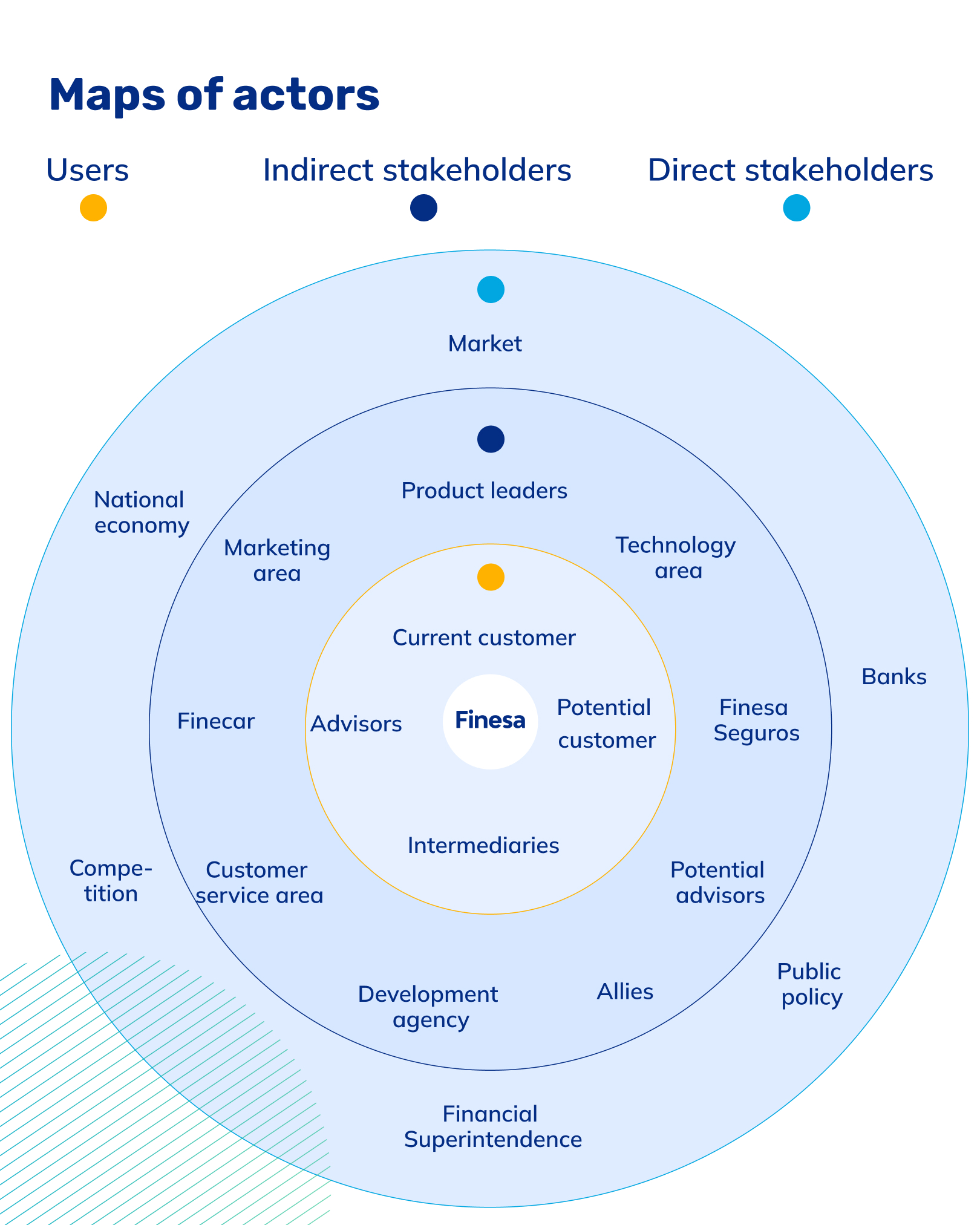
The project addressed a fragmented ecosystem spanning the corporate website, payments, vehicle financing, marketplace, and business administration experiences.
90% of policy purchases
were advisor-assisted before the redesign.
110 Research Participants
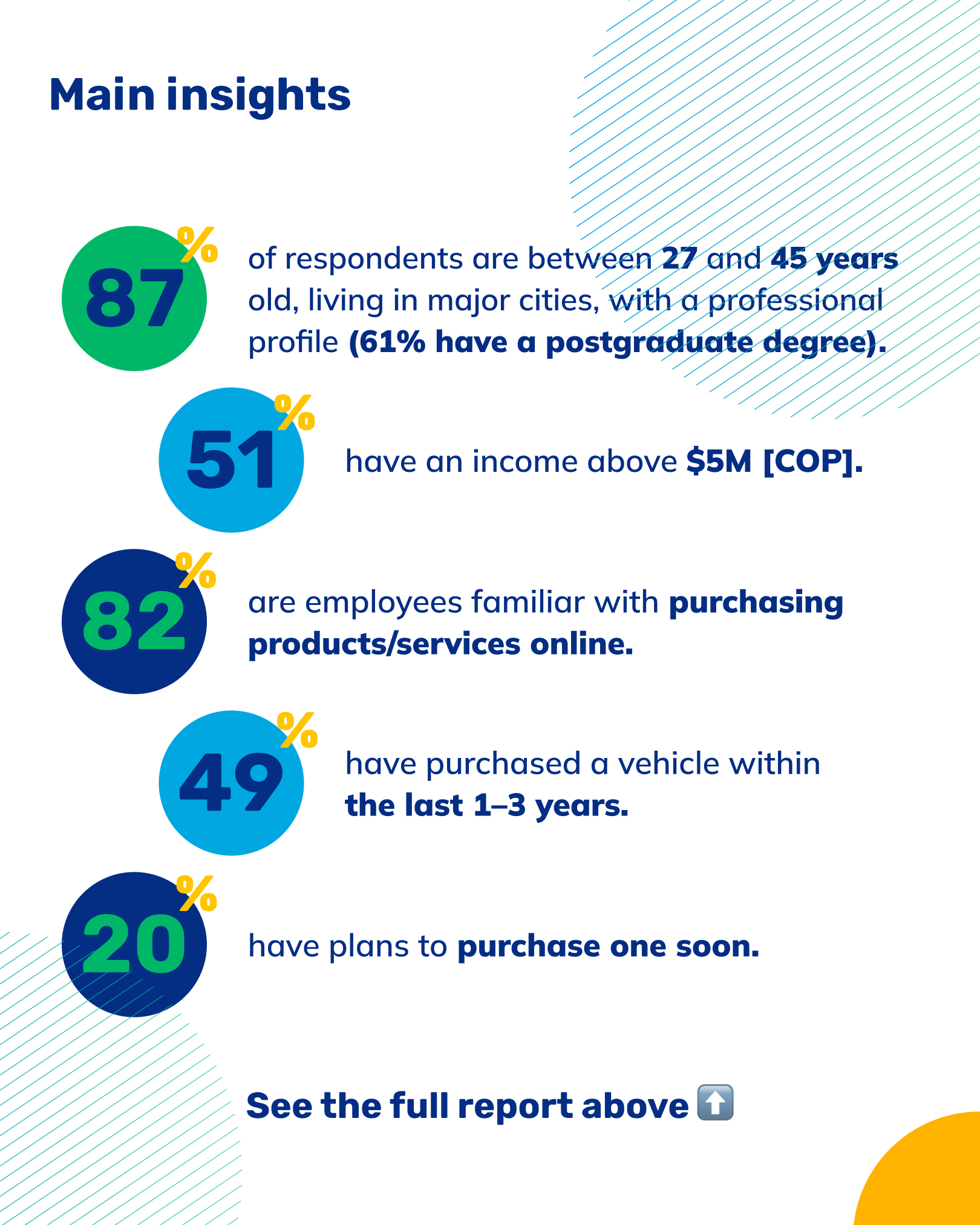
Discovery research incorporated input from 110 users and stakeholders across interviews, surveys, and information architecture research.



Related Work



Let’s Talk