Expresia Brand

Overview
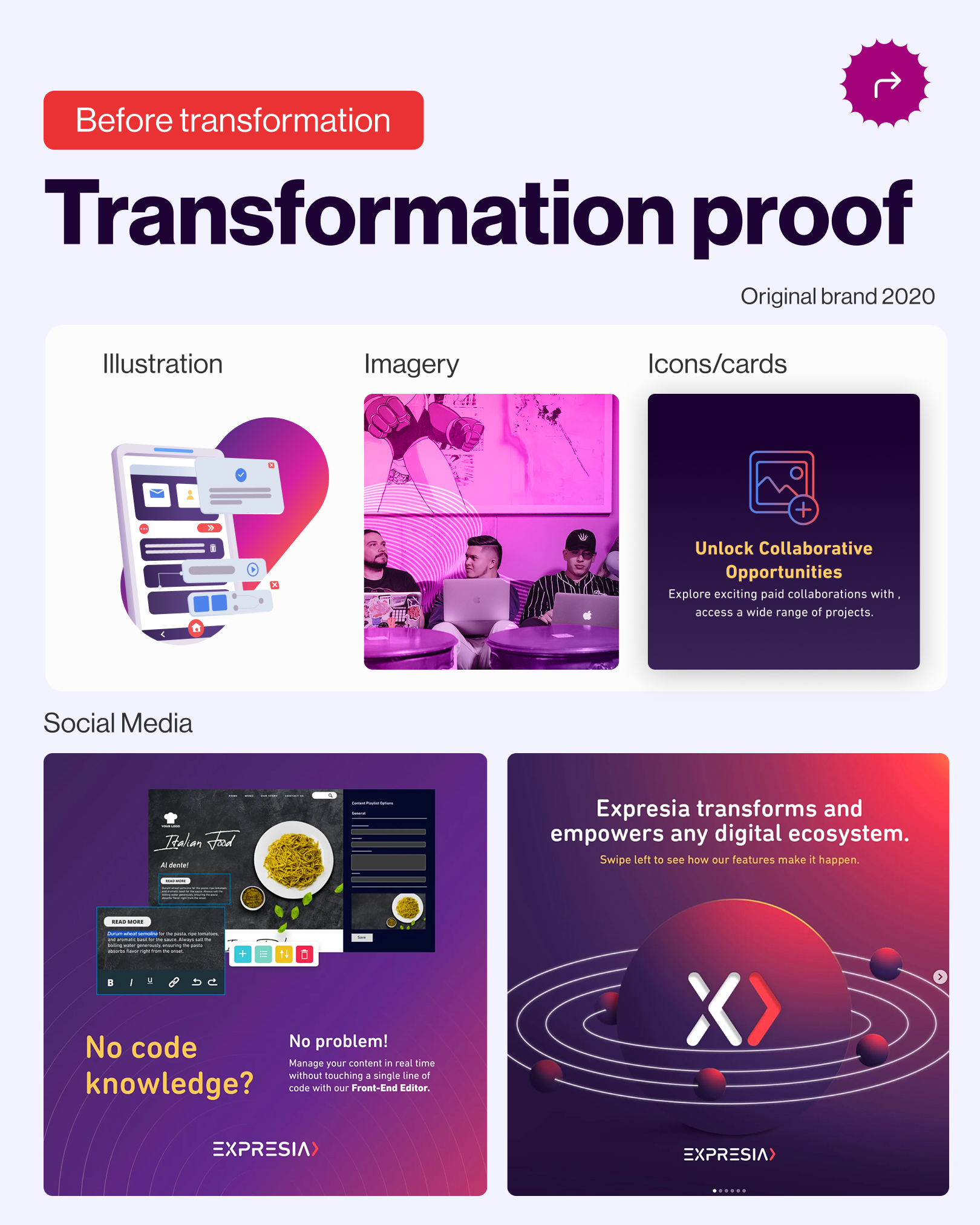
Expresia’s visual identity had become outdated and no longer reflected the maturity or ambition of the product. The goal was not to create a completely new brand, but to evolve the existing identity into a more modern, flexible, and digital-first experience while preserving its recognizable logo and core color palette.
As Lead Product Designer, I worked directly with key stakeholders to define the new look and feel and translate that direction into a cohesive visual system. I led the UI direction across the website and marketing ecosystem, establishing the typography, color usage, gradients, graphic elements, layouts, and reusable patterns that would shape the refreshed brand experience.
The result was an evolution of the existing identity into a more confident and contemporary system designed to support Expresia’s positioning as a forward-thinking DXP. The refreshed brand direction itself emphasizes adaptability, transformation, innovation, and a premium product experience.
Key Services Provided
Role: Lead Product and Brand Designer
I led the Brand visual direction of the brand refresh, working directly with stakeholders to define the new creative direction and collaborating with developers to ensure the system could be translated consistently into the digital experience.
My responsibilities included:
- Stakeholder collaboration and design direction.
- Visual exploration and art direction.
- UX/UI design
- Brand Design and system creation
- Design review and quality assurance.
The Challenge
The challenge was to modernize Expresia without losing the brand recognition it had already built.
The existing visual language felt dated and did not reflect the sophistication or future-facing positioning of the product. At the same time, the refresh had clear constraints: the recognizable identity needed to remain intact, which meant evolution rather than reinvention.
I worked directly with stakeholders to define how far the visual language could evolve and identify the elements that should remain recognizable. From there, I developed a new UI direction that preserved Expresia’s core identity while introducing a stronger typographic hierarchy, more contemporary layouts, refined gradient treatments, clearer visual rules, and a more scalable system for digital applications.
This is also consistent with the final system documented in the brand book, which positions the identity around flexibility, innovation, agility, and a stronger premium perception
Goals
User Goals
- Create a clearer and more intuitive experience across key digital touchpoints.
- Improve content hierarchy and make product information easier to scan and understand.
- Make complex DXP capabilities feel more approachable and easier to explore.
- Create a consistent experience across desktop, tablet, and mobile.
- Improve readability and accessibility through clearer typography, contrast, and visual hierarchy.
Brand Goals
- Modernize Expresia’s visual identity while preserving its recognizable logo and core brand colors.
- Better reflect the maturity, innovation, and ambition of the platform.
- Strengthen the connection between the brand identity and Expresia’s positioning as a forward-thinking DXP.
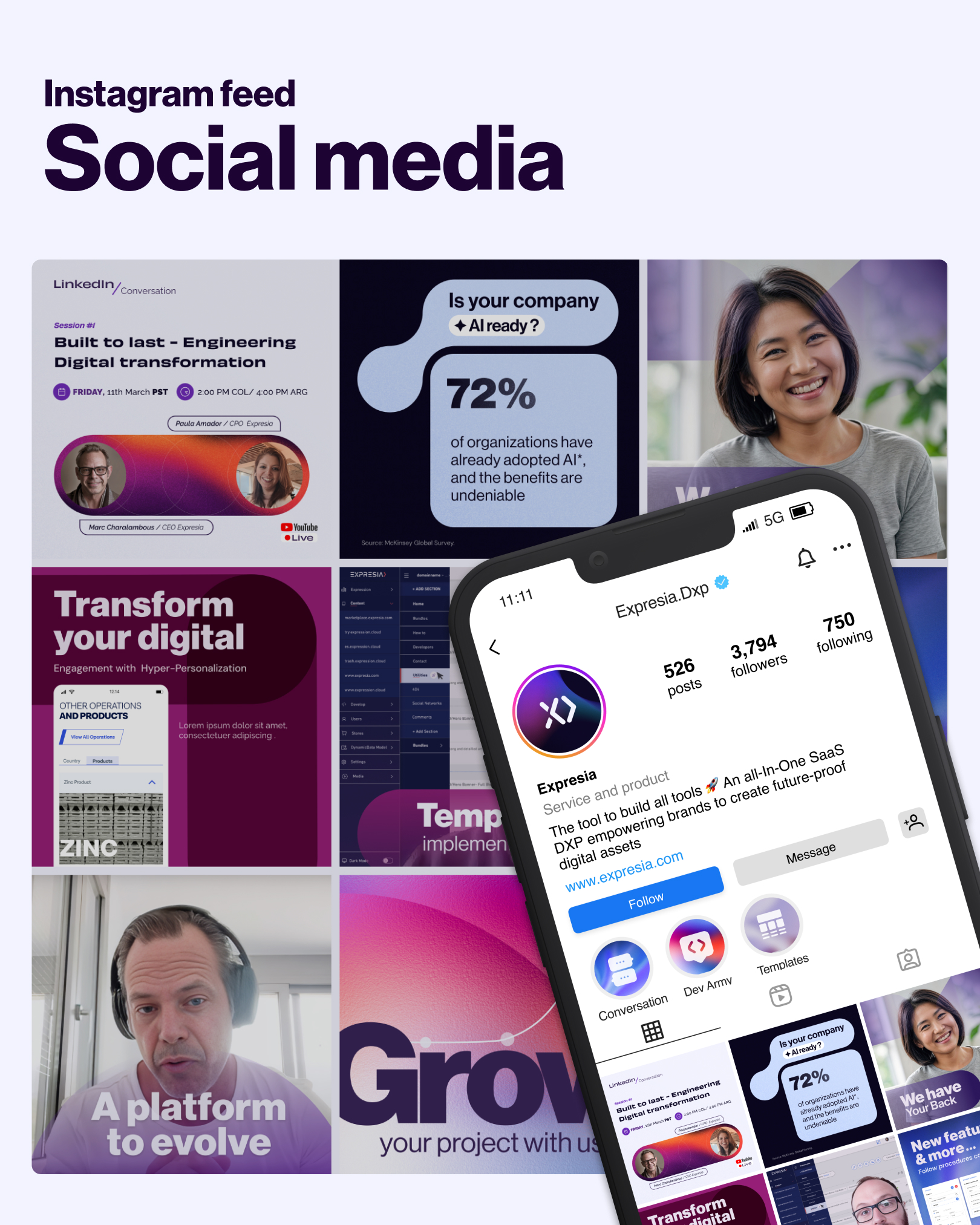
- Create a flexible visual system that could scale across the website, marketing campaigns, presentations, and future digital touchpoints.
- Establish clear design guidelines that support consistency across design, development, and marketing teams.
Design Approach
I began by reviewing the existing identity to understand which elements were essential to brand recognition and which were limiting the digital experience.
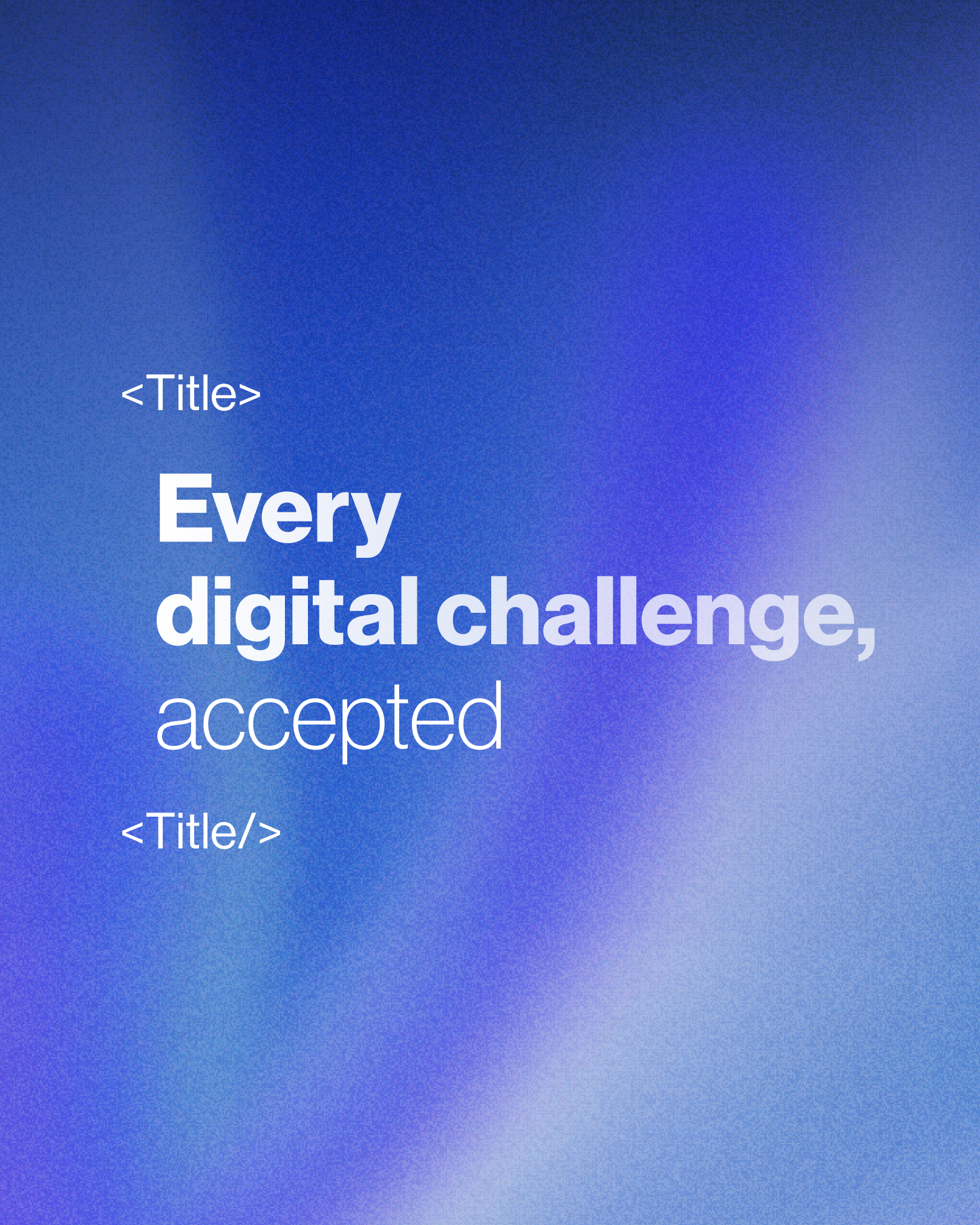
Rather than replacing the brand, I evolved its existing visual DNA. The original identity was built around concepts of movement, depth, light, and atomic forms. I simplified and reinterpreted those ideas into a cleaner digital language with more intentional gradients, stronger typography, flexible graphic elements, and clearer composition rules.
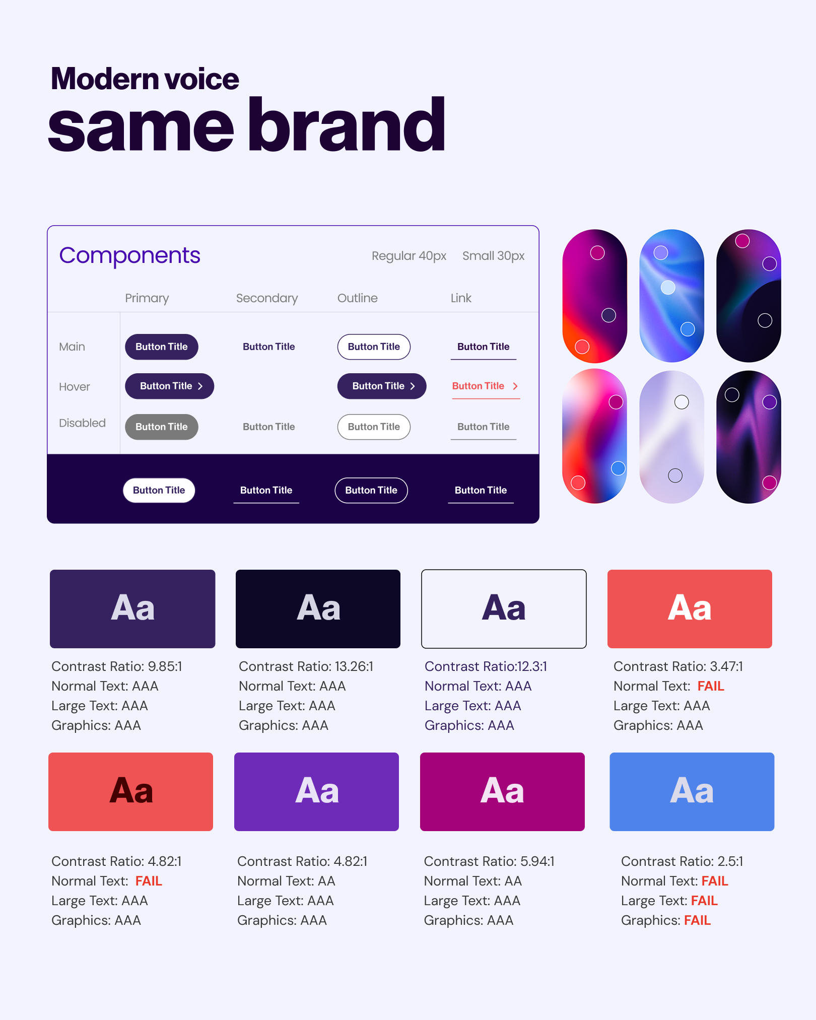
The system was then expanded beyond individual pages into reusable rules for typography, color, imagery, graphic treatments, responsive layouts, and UI patterns. The refreshed documentation defines specific rules for typography hierarchy and alignment, digital legibility, color hierarchy, and accessibility.
Project Solutions
My approach focused on creating solutions specific to what was actually designed:
- Evolved Visual Language — Modernized the existing identity without replacing its core logo or recognizable brand colors, creating a visual evolution rather than a disconnected rebrand.
- Digital-First Typography System — Introduced a clearer hierarchy for display and body typography, with rules for weight, alignment, spacing, readability, and responsive use. The system documents display typography for strong visual impact and body typography optimized for legibility across devices
- Expanded Color & Gradient System — Evolved the existing palette into structured color families and established clearer rules for primary, secondary, background, and supporting colors.
- Flexible Graphic Language — Transformed the original brand concepts of movement, light, depth, and dimensionality into a more contemporary visual system that could work across product, website, marketing, and presentation contexts.
- Scalable Design Foundation — Created reusable visual and UI rules so future pages and marketing assets could maintain consistency without requiring every experience to be designed from scratch.
Outcomes
Key outcomes included:
- A unified digital identity - the refresh created a more cohesive visual language across the website, marketing materials, presentations, and other brand touchpoints.
- A scalable design foundation - typography, color, gradients, graphic elements, imagery, and layout principles were documented as a system rather than treated as isolated design decisions. The 2024 brand book spans logo usage, typography, color and gradients, shapes and patterns, photography, infographic style, tone of voice, and use cases.
- A stronger connection between brand and product positioning - the new visual direction was designed to better express Expresia as a confident, ambitious, forward-thinking DXP while preserving continuity with the existing identity.
- Clearer cross-team implementation - the expanded guidelines gave design, development, and marketing teams a shared framework for applying the identity consistently across future touchpoints.


Related Work



Let’s Talk